

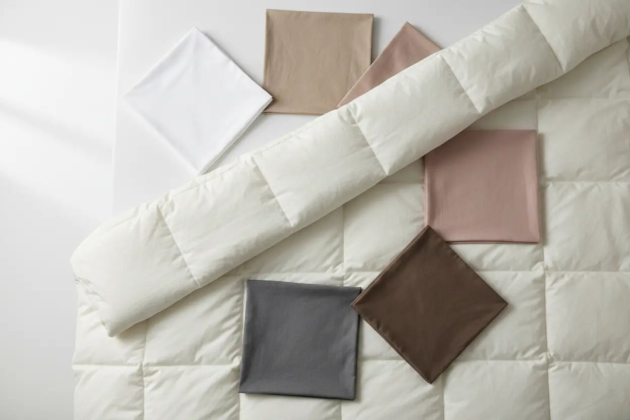
What Color Sheets Go With a Cream Comforter? A Complete Pairing Guide
Cream comforters look best with white, soft gray, warm beige, or muted earth-tone sheets - these shades pick up cream's warmth without fighting it for attention. If you want contrast, a deeper charcoal or navy sheet set works too, as long as the undertone stays warm rather than stark. The right choice mostly comes down to your wall color, furniture, and the mood you want your bedroom to have. If you've already looked at pairing ideas for a different shade, our guide on What Color Sheets Go with a White Comforter breaks down a related but slightly different challenge, since cream carries more warmth than true white.
This guide walks through the full answer: which colors work, why they work, how to think about color theory without overcomplicating it, and what to consider before you buy. We'll also cover when sheets should match your comforter and when they shouldn't, plus a few safe pairing rules you can use for any bedroom.

Quick Answer: What Color Sheets Go With a Cream Comforter?
If you only read one section, read this one. Cream comforters pair well with:
- White sheets - for a crisp, clean look that brightens the whole bed
- Soft neutrals (beige, taupe, oatmeal) - for a warm, cohesive palette
- Gray sheets - for gentle contrast without going cold
- Earth tones (terracotta, olive, warm brown) - for a grounded, natural feel
- Deeper tones (navy, charcoal) - for contrast, used sparingly with warm undertones
There's no single "correct" shade here - the best comforter colors to pair with cream depend on your room's existing palette. But these five categories cover almost every bedroom style, from minimalist to layered and warm.
If you're short on time, start with a warm neutral or white sheet set. Both are safe, widely tested pairings that work in nearly every room, and you can always layer in a bolder color later through throw pillows or a bed runner instead of committing to it across the whole sheet set.
Best Bed Sheet Color Trends for a Cream Comforter
Bedding trends shift year to year, but certain sheet colors consistently pair well with cream because they share or complement its warm undertone. Below are the categories seeing the most consistent use with cream comforters right now.
These categories aren't arbitrary - each one solves a slightly different styling problem. White sheets solve for brightness. Neutrals solve for cohesion. Gray solves for balance. Earth tones solve for warmth and texture. Knowing which problem you're trying to solve in your own bedroom makes the decision much faster than scrolling through inspiration photos looking for "the one."
Simple White
White sheets are the safest, most versatile choice for a cream comforter. Because cream already leans warm, a bright white sheet set adds just enough contrast to keep the bed from looking flat or one-note - a similar principle to the one covered in What Color Sheets Go with a White Comforter, just applied to a warmer base tone. Our Everyday Ease 400 Sateen Cotton Sheet Set in bright white is a common pairing for exactly this reason.
- Makes the comforter the visual focus - ideal if it has texture or quilting detail
- Reads clean and bright without turning the bed cold or clinical
- Pairs with almost any wall color or furniture finish
Neutrals
Sticking within the neutral family - beige, taupe, oatmeal, sand - creates a soft, cohesive look. This is the pairing most people land on when they want their bedding to feel calm and unified rather than contrast-driven.
- Hides everyday wrinkles better than stark white
- Works with almost any wall color or wood tone
- Rarely needs restyling when you refresh throw pillows or a bed runner
Gray
Gray sheets sit between white and the deeper tones, offering contrast without cooling the room down too much.
- A warm-toned gray ("greige") pairs better with cream than a cool, blue-based gray
- Adds definition without competing with the comforter
- Works well in rooms with mixed metal and wood tones
Earth Tones
Terracotta, olive, rust, and warm brown sheets bring an organic, grounded feel to a cream comforter. This pairing has grown popular in bedrooms leaning into a natural, understated aesthetic. Our Bed Sheets collection includes several earth-toned options if this is the direction you're leaning.
- Adds texture and warmth without high contrast
- Suits organic, bohemian, or nature-inspired room styles
- Pairs especially well with wood furniture and woven textures
Which Bed Sheets Go With Cream Comforters? A Color-by-Color Breakdown
To make this easier to apply to your own room, here's a quick breakdown of what each sheet color communicates when paired with a cream comforter:
- White: Clean, bright, classic - best for rooms that already have some color elsewhere
- Beige/Taupe: Warm, quiet, cohesive - best for a calm, low-contrast bedroom
- Gray: Balanced, modern, versatile - best if your room has cooler accents too
- Earth tones: Grounded, natural, textural - best for organic or bohemian-leaning rooms
- Navy/Charcoal: Bold but still warm - best used as an accent, not an everyday default
None of these are "wrong." The point of this guide is to help you pick the one that fits your room, not to hand you a single rule that ignores your actual space.
It also helps to think about how often you'll be swapping out sheets versus how attached you are to the comforter itself. Sheets are easier and less expensive to change seasonally, so if you're unsure, treat the sheet color as the flexible piece of the equation and the comforter as the anchor. That way, you can experiment with gray one season and earth tones the next without redoing the whole bed.
Our Top Sheet Pick for a Cream Comforter
If we had to recommend one starting point, it's a warm-toned neutral sheet set - something in beige or soft taupe that echoes the comforter's undertone instead of contrasting against it. This pairing is forgiving, easy to style around, and rarely looks dated. The Everyday Ease 400 Sateen Cotton Sheet Set in Beige is a common choice for exactly this reason - it sits close enough to cream to feel intentional, without matching so closely that the bed looks flat.
If your room leans more graphic or contrast-driven, white is the second-safest choice, and it's the pairing most people try first before branching out. Our full Bed Sheets collection makes it easy to compare shades side by side before deciding.
Think About Color Theory, Style, and Mood
Choosing sheet colors doesn't need to be complicated, but a little color theory goes a long way toward avoiding a mismatched bed.
Brainstorm Ideas Using Color Psychology
Cream reads as warm, soft, and welcoming. The sheet color you pair with it can reinforce that mood or shift it:
- Beige, warm gray, terracotta: Reinforce a calm, restful mood
- True blue, icy gray, cool white: Feel more energizing or formal
- Soft sage, dusty rose: Add a gentle, lived-in warmth without matching cream exactly
Neither direction is wrong - they just create different moods in the room, so it's worth naming the trade-off before you buy.
Use Color Theory for Inspiration
On a basic color wheel, cream sits close to warm neutrals and earth tones, which is why those pairings feel effortless. Colors on the cooler side of the wheel - navy, charcoal, slate - create more visual contrast. Used sparingly (a duvet cover trim, a throw pillow, or one accent sheet layer), that contrast can look intentional rather than mismatched.
You don't need a formal color theory background to use this well:
- Hold your sheet swatch next to your comforter in natural daylight, not warm bulb lighting, which can shift how colors read
- Check whether the two feel like they belong in the same "family" - both warm, or both cool
- When they match temperature (warm-with-warm or cool-with-cool), the pairing will almost always work - this is the fastest shortcut to the best comforter colors for your specific room

Should Your Sheets Match Your Cream Comforter?
This is one of the most common questions we hear, and the honest answer is: it depends on the look you want.
Matching vs. Complementary Pairing
There are two directions here, and both are among the best comforter colors and sheet pairings you can choose - it just depends on the look you're after:
- Matching: Sheets closely echo the cream comforter, creating a soft, monochromatic look that feels calm and understated
- Complementary: Sheets pick a related but different color, adding depth and a more layered look
Neither approach is more "correct" - matching tends to suit minimalist rooms, while complementary pairing suits rooms with more pattern or texture elsewhere.
Safe, Simple Pairing Rules for Cream Comforters
If you'd rather not overthink it, these rules cover most situations:
- Stay within one shade family (warm neutrals) for a foolproof, cohesive look
- Add one contrast layer (a gray or deeper accent) if the bed feels flat
- Avoid pairing cream with a stark, cool-toned white - the undertones can clash
- When in doubt, match your sheet color to your room's existing neutral, not just the comforter
Neutral Sheets vs. Patterned Sheets
- Neutral sheets: The lower-risk option - pairs with almost any cream comforter, any room style
- Patterned sheets: Stripes or subtle prints can work too, but should stay in the same warm color family as the comforter
- Avoid: Cool-toned patterns, which fight with cream's warmth instead of complementing it
Account for Your Wall Colors When Picking Sheet Colors
Your walls set the backdrop for everything else in the room, so they should factor into your sheet color decision as much as the comforter does.
- Warm white or beige walls: Almost any neutral or earth-tone sheet will work
- Cool gray or blue walls: A warm-toned sheet color (beige, taupe) helps bridge the contrast between walls and bedding
- Bold accent walls: Stick to simple neutrals on the bed so the wall stays the visual focus
- White walls: The most flexible backdrop - nearly every sheet color pairing works here
If your walls run cooler than your comforter, leaning toward a warmer sheet color usually smooths out the transition better than adding another cool tone.
Match Your Comforter With Your Headboard and Furniture
Furniture and headboard tone matter just as much as walls. Wood tones, in particular, tend to guide the best comforter colors and sheet pairings without you needing to think too hard about it.
- Light or natural wood furniture: Pairs naturally with white, beige, or soft gray sheets
- Dark wood furniture: Benefits from a slightly warmer or deeper sheet tone to avoid too much contrast
- Upholstered or fabric headboards: Try to pull one sheet color from the headboard's fabric for a pulled-together look
- Metal or black-frame beds: A crisp white or warm gray sheet set balances the cooler metal tones well
This is one of the areas people overlook most often. It's easy to focus entirely on the comforter and sheets and forget that the bed frame and nightstands are in the same sightline every time you walk into the room. Taking a photo of your furniture and holding sheet swatches up against it - even on your phone - is a quick way to catch a mismatch before you buy.
Caring for Cotton Sheets and Your Cream Comforter
Whatever color you land on, how you wash your bedding affects how long that color stays true.
- Wash sheets in cool or warm (never hot) water to protect both color and fiber
- Skip fabric softener on cotton - it coats the fibers and dulls the fabric's natural feel over time
- Line-dry or use a low-heat tumble cycle to help colored sheets hold their tone wash after wash
- Wash new colored sheets separately for the first few cycles to catch any excess dye before it reaches lighter pieces
If you tend to run warm at night, sheet color has less to do with comfort than fabric and weave do. Our guide on The Best Sheets and Comforters for Hot Sleepers covers which materials feel lighter and more breathable, regardless of which color you choose.
Darker sheet colors - navy, charcoal, deep earth tones - tend to show lint and fading faster than lighter neutrals, simply because contrast makes wear more visible. That's not a reason to avoid them, just a reason to stay consistent with the wash routine above.
What to Consider When Choosing the Best Comforter Colors and Sheets
Before you settle on a sheet color, walk through these five factors. Together, they cover almost every variable that affects whether a pairing will look intentional or accidental.
Sheet Color for Your Cream Comforter
- Start with undertone, not just shade - a warm beige and a cool taupe can look similar alone but clash next to cream
- Look at fabric swatches together in daylight before deciding
- Request a swatch or check customer photos before ordering - screen colors rarely match true fabric tone
Wall Color
- Warmer walls give you more flexibility with sheet color choices
- Cooler walls benefit from a warmer sheet tone to bridge the gap
- Bold accent walls call for simple neutrals on the bed
Headboard and Furniture Color
- Wood tones and furniture finishes should feel like part of the same palette as your bedding
- Light wood pairs easily with almost any sheet color
- Dark wood or black-frame beds benefit from a warmer or deeper sheet tone for balance
Room Size
- Small rooms: low-contrast pairing (cream comforter with a similar neutral sheet) reads larger and less busy
- Large rooms: more contrast - gray or earth-tone sheets - reads intentional rather than sparse
- Multi-use rooms (workspace, reading nook): calmer, low-contrast palettes hold up better daily
Mood and Sleep Goals
- Soft neutrals and warm tones read as calmer and more restful
- Higher-contrast pairings feel more energizing or formal
- If comfort matters most, our piece on The Best Sheets and Comforters for Hot Sleepers is worth a look alongside your color decision
Why California Design Den Sheets Work With Any Cream Comforter
Whichever direction you choose - crisp white, warm neutral, gray, or earth tone - the color only tells half the story. How the sheets feel against your skin every night is what actually matters once the decor decision is made. A few things stay constant across every color we offer:
- 100% natural cotton - no synthetic microfiber, no plastic fibers
- Softens with every wash instead of pilling or thinning out
- Good Housekeeping Seal - our cotton sateen sheet sets have earned this, evaluated by the GH Institute for everyday durability
- Family-owned for over 20 years, with pricing that skips the usual cotton markup
Color trends come and go, but the fabric underneath is what determines how the sheets hold up season after season. Whether you're drawn to the bright white of our Everyday Ease 400 Sateen Cotton Sheet Set or the warmer tone of the Everyday Ease 400 Sateen Cotton Sheet Set in Beige, both share the same 400-thread-count weave and smooth, breathable texture.
Most of our cotton sheets are made in our family-owned facility, which is what lets us keep quality high without stacking on a middleman markup.
If you're building out a full cream-comforter setup, our duvet covers collection includes neutral and earth-tone options designed to sit alongside the same sheet palette discussed in this guide, so your whole bed reads as one cohesive decision instead of separate purchases.

FAQs About Sheet Colors for a Cream Comforter
These are the questions we hear most often once someone has narrowed down their options but wants a quick, direct answer before buying.
Should sheets be lighter or darker than comforters?
Either works. Lighter sheets look soft and airy; darker sheets add contrast. With cream, warm-toned options in both directions pair best.
What color bedding for a cream bed?
White, beige, taupe, gray, and warm earth tones pair well with a cream bed. Choose based on your walls, furniture, and how much contrast you want.
Should your bed sheets match your comforter?
Not necessarily. Matching gives a calm, unified look; a complementary color adds depth. Both work - it comes down to personal style and room mood.
What sheets look good with cream comforter?
White, soft neutrals, warm gray, and earth tones all look good with a cream comforter. Avoid stark, cool whites, which clash with cream's warmth.
Should your sheets be lighter or darker than your comforter?
Test both in daylight against your walls and furniture. Light tones suit airy rooms; darker tones add coziness and depth to the space.
Final Thoughts: Choosing Sheet Colors for a Cream Comforter
There's no single right answer to what color sheets go with a cream comforter - white, neutral, gray, and earth-tone sheets all work, depending on your walls, furniture, and the mood you're going for. Start with your room's existing palette, lean warm rather than cool when in doubt, and choose a sheet color you'll still like next season, not just this one. Small swaps - a new sheet color, a fresh pillow layer - are the easiest way to keep the bed feeling current without replacing the comforter itself.


