

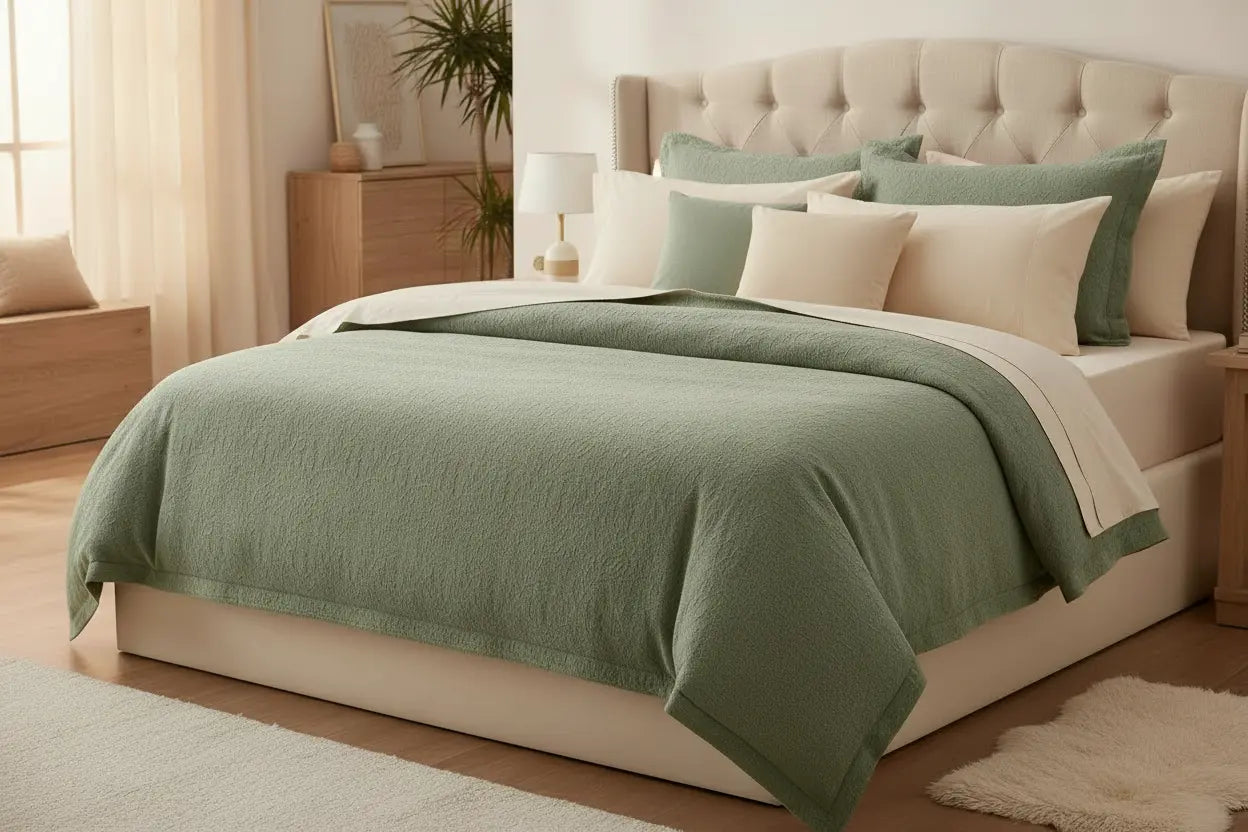
What color sheets go best with a sage green comforter?
Cream, warm white, blush pink, terracotta, and soft charcoal are the easiest colors to pair with a sage green comforter, since each one either softens or grounds the muted green tone. Sage is a low-contrast, gray-green shade, so it plays well with almost any neutral or muted color rather than fighting for attention. If you're also deciding what color sheets go with a cream comforter, the logic is nearly identical - you're matching sheet tone to a soft, muted base color rather than a bold one.
The right sheet color mostly comes down to the mood you want: calm and monochrome, crisp and minimal, or layered and full of texture. Below, we'll walk through each direction with real color pairings, plus a buying guide and care tips so your sage green bedding actually holds up wash after wash.

Quick Answer: Best Sheet Colors for a Sage Green Comforter
If you only read one section, read this one. Here's a fast breakdown of what color sheets go with a sage green comforter, based on the look you're going for:
- Cream or warm white - the safest, most versatile pairing; lets sage green stand out
- Sage green or seafoam - a monochrome, calming look with subtle tonal depth
- Blush pink or dusty rose - soft, warm contrast that feels romantic without being loud
- Terracotta or rust - an earthy, grounding pair that leans into sage's natural undertones
- Charcoal gray or navy - adds depth and makes sage green read as more sophisticated
- Mustard or ochre - a bolder, maximalist option for pattern-lovers
Each of these works because sage green is a muted, low-saturation color. It doesn't clash easily - it just needs a sheet color that either matches its softness or gives it something to contrast against. Think of sage green less as a color to design around and more as a neutral with a slight tint, closer in behavior to gray or beige than to a true green.
Sage Green: A Subtle Accent for Sheet Colors in Your Bedroom
Sage green reads as calm rather than bold, which is exactly why it works as a background note instead of the star of the room. When you treat your comforter as a subtle accent, your sheets do the heavy lifting for texture and tone, and the room feels considered rather than themed. A few reasons this approach tends to work:
- Sage rarely fights with an existing color scheme
- You can swap sheet colors seasonally without redoing the whole room
- It photographs well in both warm and cool lighting
Cream and Ivory Sheets for a Soft, Subtle Look
Cream and ivory sheets are the most forgiving choice for a sage green comforter. They don't compete with the green - they cushion it, the same way they would with a cream comforter, warm beige throw, or a soft dusty blue accent pillow. This pairing works in almost any bedroom style, from farmhouse to transitional to soft modern.
- Cream sheets under a sage comforter create a warm, sunlit look even in low light
- Ivory reads slightly more formal than bright white, which suits sage's quiet tone
- Both colors photograph well for listing photos if you're staging a room
- Cream pillowcases paired with a sage flat sheet split the difference nicely if you want a hint of tone without going fully monochrome
The Everyday Ease 400 Sateen Cotton Sheet Set in a warm white tone is one of the simplest ways to get this look without overthinking the color wheel. A cream comforter follows almost the same rulebook, so if you're furnishing more than one room, the What Color Sheets Go Best With a Cream Comforter guide is a useful companion piece to this one.
Warm Neutrals That Let Sage Green Lead the Room
Beige, oatmeal, and taupe sheets sit one shade warmer than cream, and they work especially well if your room already leans neutral. These tones let the sage green comforter act as the only real color statement in the room, while the sheets stay quiet in the background. This is one of the simplest sage bedding ideas if you're not ready to commit to a full color scheme yet.

Monochrome or Complementary: Pairing Sheet Colors With a Sage Green Comforter
There are really two directions once you move past neutrals: stay in the same color family (monochrome), or pull in a different hue that plays off sage green's undertones (complementary). Neither is more "correct" - it depends on whether you want the bed to feel unified or layered.
Monochrome Sage Bedding Ideas for a Calm, Layered Look
A monochrome bed - where the sheets and comforter sit in the same green family - tends to feel restful and cohesive, almost like a single fabric with texture instead of pattern. Sage-on-sage bedding works best when the two shades aren't identical; a slightly deeper or lighter green sheet against the comforter creates dimension instead of flattening the look.
- Pair a lighter sage sheet with a deeper green or hunter green comforter for contrast within the family
- Seafoam sheets against a sage comforter read as coastal and fresh
- Avoid using the exact same green for sheets and comforter - it can look one-note in photos
The Everyday Ease 400 Sateen Cotton Sheet Set in Sage Green is a practical way to try this look, since it's cut from the same soft, relaxed weave as the rest of the collection.
Complementary Colors for a Comforter With Sage Green Accents
If your comforter with sage green accents also includes cream, gray, or a botanical print, you have more room to pull an accent color into the sheets. Blush pink, dusty lavender, and warm terracotta all sit comfortably across from sage green without turning the room busy, because sage is muted enough to absorb a stronger neighboring color.
- Blush pink sheets soften sage green and add warmth to a north-facing room
- Terracotta or rust sheets echo sage's earthy, botanical origins
- Dusty blue sheets create a calm, slightly coastal contrast
- Warm gray sheets sit between neutral and complementary, working with almost any accent color already in the room
None of these pairings require matching your walls, curtains, or rug exactly. Sage green's low saturation means it borrows warmth or coolness from whatever sits closest to it, so a small swatch test against your actual comforter - in daylight, not under a lamp - is more reliable than any color chart.
Minimalist and Maximalist Ways to Style a Sage Green Comforter
Once you've picked a color direction, the next decision is how much you layer on top of it. A minimalist bed uses fewer colors and simpler textures; a maximalist bed leans into pattern, mixed textures, and more pillows. Both can use the exact same sheet color - the difference is in the styling. A quick gut check for which direction fits you:
- You reach for solid colors over patterns when shopping → minimalist
- You already own more than three throw pillows → maximalist
- Your nightstand has more than two objects on it at any time → maximalist
- You'd rather make one big color decision than five small ones → minimalist
A Minimalist Approach to Sheet Colors for a Sage Green Comforter
A minimalist bed usually sticks to two colors total: the sage green comforter and one sheet color, plus maybe one accent pillow. This keeps the room feeling calm and uncluttered, which is why so many sage bedding ideas online default to a simple cream-and-sage combination.
- Stick to solid sheets - patterned sheets under a solid comforter can feel busy fast
- Use one accent pillow, not four, to keep the look intentional
- Let the fitted sheet and pillowcases match exactly for a clean, unfussy line
- Choose a single metal finish for lamps and hardware so the room reads as one decision, not several
Minimalist bedrooms also tend to age better in photos, since there's less to date the look. If you're staging a room to sell or rent, this is usually the safer route.
A Maximalist Approach: Layering Prints and Textures
A maximalist take on a sage green comforter brings in pattern, texture, and a wider color story - think a striped or floral sheet peeking out from under the comforter's fold, plus a mix of throw pillows in terracotta, mustard, and cream. This works especially well in bedrooms that already have some pattern in the curtains or rug, since the bed becomes part of a bigger, layered look rather than the only statement piece.
- Mix a printed flat sheet with a solid fitted sheet for texture without overload
- Add a woven throw in a contrasting warm tone at the foot of the bed
- Layer two to three pillow colors instead of one, using sage as the anchor tone
- Bring in a patterned rug or curtains in a related earthy tone so the bed doesn't feel like the only styled surface in the room
The risk with a maximalist bed is that it can tip into cluttered if every element competes for attention. Keeping the comforter itself solid - and saving the pattern for sheets, pillows, and throws - usually keeps the look feeling intentional rather than accidental.

Get Inspired by Greenery and Nature: Sage Bedding Ideas
Sage green is, at its root, a plant color - closer to dried herbs and eucalyptus than to a bright, saturated leaf green. That's part of why it pairs so naturally with earthy, botanical styling rather than sleek or high-contrast decor. A few materials tend to show up again and again in these rooms:
- Linen or cotton in warm neutrals
- Unfinished or lightly stained wood
- Rattan, jute, or other woven natural fiber
Botanical Prints and Earthy Textures
If you want your bedroom to feel like an extension of the outdoors, lean into linen textures, rattan, and botanical prints alongside your sage green comforter. A botanical-print sheet set - even just on the pillowcases - reinforces the nature-inspired mood without requiring a full redesign.
- Woven or textured throws add depth without adding more color
- Wood and rattan nightstands or headboards pair naturally with sage tones
- A single botanical print pillow can do more work than an entire patterned sheet set
Bringing the Outdoors Into Your Bedroom
Sage green bedding pairs especially well with warm wood tones, dried florals, and natural light. If your room runs a little cool or dim, warmer sheet colors - cream, terracotta, or a soft mustard - will balance that out better than a stark white would. This is one of the easiest sage bedding ideas to apply, since it usually just means swapping a cool-toned sheet for a warmer one.
A few small additions carry a lot of this look: a woven basket for extra pillows, a ceramic vase with dried eucalyptus, or linen curtains in a warm off-white. None of these require touching your existing furniture - they just reinforce the same natural, unfussy mood your sheets and comforter are already setting.
Caring for Sheets and a Sage Green Comforter
Color-matching only matters if the colors actually stay true after washing. Sage green and its typical sheet partners - cream, blush, terracotta - are all prone to fading if they're washed incorrectly, so a little care up front protects the exact look you built.
Washing and Drying Tips
- Wash sheets and comforters in warm water with like colors, on a gentle cycle
- Avoid bleach on both sage green and light-colored sheets - it dulls and yellows fabric over time
- Tumble dry on medium heat and remove promptly to prevent set-in wrinkles
- Wash colored sheets separately from bright white ones for the first few cycles
Keeping Colors From Fading
Sun exposure fades sage green faster than most neutrals, so if your bed sits near a window, rotate which side faces the light when you change the sheets. Cotton sheets, in particular, tend to soften with every wash rather than break down, which helps the color and the feel hold up together over time.
A few habits go a long way here. Wash on the shortest cycle that still gets the job done, since extended agitation wears on dye faster than the wash itself. Skip fabric softener on sateen weaves - it builds up over time and can dull the subtle sheen that makes a sage or cream sheet color look fresh. If you sleep warm and are choosing between fabrics, the The Best Sheets and Comforters for Hot Sleepers guide covers which weaves hold color best while staying comfortable across seasons.
What to Look for When Choosing Sheets for a Sage Green Comforter
Color is only half the decision. The material, weave, and thread count all affect how a sheet color actually looks against sage green - a shiny sateen reads differently than a matte percale, even in the exact same shade. Before you buy, run through this short list:
- Confirm the weave (sateen vs. percale) matches the finish you want
- Check the fabric is 100% natural cotton, not a cotton blend
- Match the pocket depth to your mattress before checkout
Thread Count and Feel for Sheets That Match a Sage Green Comforter
Thread count is a selection tool, not a quality ranking - it tells you how the sheet will feel and drape, which affects how the color sits against your comforter.
|
Thread Count |
Feel |
Best For |
|
400TC |
Soft, smooth, airy |
Everyday use, warm rooms |
|
600TC |
Soft, smooth, slightly dense |
Most bedrooms, year-round |
|
800TC |
Substantial, smooth, dense |
Those who like a heavier feel |
|
1000TC |
Soft, smooth, rich |
Maximum density and drape |
Choose based on how you like your sheets to feel - not just the highest number on the label. If warmth or breathability factors into your decision too, the The Best Sheets and Comforters for Hot Sleepers guide breaks down which thread counts and weaves feel lightest against skin.

Cotton Quality and Weave
- 100% natural cotton holds color better than blended or synthetic fabrics over repeated washes
- A relaxed sateen weave gives colors a soft, subtle sheen, which suits sage green's muted tone
- Single-ply, long-staple cotton yarns tend to soften with wash instead of pilling or thinning
- Skip anything synthetic if you're trying to keep colors - including sage green - looking accurate over time
- Check the fitted sheet's pocket depth against your mattress before you buy; a 15–16 inch deep pocket with a full elastic band around the edge keeps the sheet from slipping and pulling loose overnight
- A pleated hem on the flat sheet and pillowcases adds a small tailored detail that reads nicer against a solid comforter than a plain-cut edge
For a wider look at how each weave behaves, browse the full Bed Sheets collection before you commit to one color. If you'd rather start from the comforter or Duvet Covers and build sheet colors around it, that collection is a good place to compare sage green options side by side with cream, white, and patterned covers.
Why California Design Den Works for a Comforter With Sage Green Accents
Getting the right sheet color for a sage green comforter starts with a fabric that holds its color and feels good against your skin, night after night. That's the part a lot of color guides skip.
- 100% natural cotton, no synthetic fibers. California Design Den sheets are made from 100% natural cotton, which means no plastic microfibers and a fabric that gets softer, not thinner, with every wash - a real advantage if you're trying to keep a specific sheet color looking right against a sage green comforter for years, not months.
- Backed by the Good Housekeeping Seal. The Everyday Ease 400 Sateen Cotton Sheet Set has earned the Good Housekeeping Seal and won the Good Housekeeping Best Bedding Award 2026 - third-party recognition that goes beyond a nice color swatch.
- Family-owned, honestly priced. California Design Den is a family-owned brand, which keeps pricing honest without cutting corners on the cotton itself.
Sheet Colors That Pair With a Sage Green Comforter
Whether you land on the monochrome or complementary route, California Design Den carries both ends of the spectrum. The Everyday Ease 400 Sateen Cotton Sheet Set in Sage Green covers the monochrome look, while the Everyday Ease 400 Sateen Cotton Sheet Set in warm white covers the neutral, contrast-based look - both in the same soft, relaxed 400TC sateen weave, so the feel stays consistent no matter which color you pick. If your comforter itself is more of a cream or ivory shade, the What Color Sheets Go Best With a Cream Comforter guide walks through that pairing in the same way.
If you're shopping for a new comforter to match sheets you already own, the Duvet Covers collection is worth a look before you buy sheets separately - sometimes it's easier to match the other direction.
Frequently Asked Questions About What Color Sheets Go With a Sage Green Comforter
What bedding goes well with sage green?
Cream, blush pink, terracotta, and soft gray all pair well with sage green - pick based on whether you want a warm or cool overall look.
Should sheets be lighter or darker than comforters?
Either works. Lighter sheets feel airy and casual; darker sheets add depth and read a bit more formal.
What colors complement sage green?
Blush pink, terracotta, mustard, and dusty blue all complement sage green without overwhelming its muted, earthy tone.
What goes with sage green in the bedroom?
Warm wood tones, linen textures, cream walls, and botanical prints all pair naturally with sage green bedding.
Should my bed sheets match my comforter?
Not necessarily. Matching creates a calm, monochrome look, while contrasting sheets add depth - both are correct choices.

Final Thoughts on What Color Sheets Go With a Sage Green Comforter
There's no single right answer to what color sheets go with a sage green comforter - cream and warm white are the safest starting point, but blush, terracotta, charcoal, and even a monochrome sage-on-sage look all work depending on the mood you're after. Start with the direction that matches your room's existing tones, then build from there with texture and pattern.
If you're still narrowing things down, it helps to see the options side by side rather than picking from a color chart alone. Browse the Bed Sheets collection in a few different tones, hold them against your comforter in daylight, and let the room tell you which pairing feels right.


